Nice to meet you! I'm Lydia, and I study Interaction Design at the University of Applied Science in Schwäbisch Gmünd. One of my favorite aspects about the school is that it teaches a user centered design approach. I enjoy creating solutions based on new technology and prototyping the developed ideas. There's nothing more satisfying than a well thought-out idea coming to life.
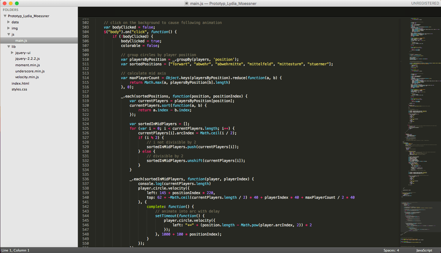
My favorite programs are the Adobe Suite, Principle and Framer. I communicate witch machines in HTML, CSS, JavaScript and Arduino C. Recently, I have used jQuery more often. This is a page for example which works with a jQuery library. In my spare time, I like to implement illustrations. You can see them by clicking here. I would love to hear your ideas for the next project. To discuss how we could work together, please leave me a message by clicking on the contact button.
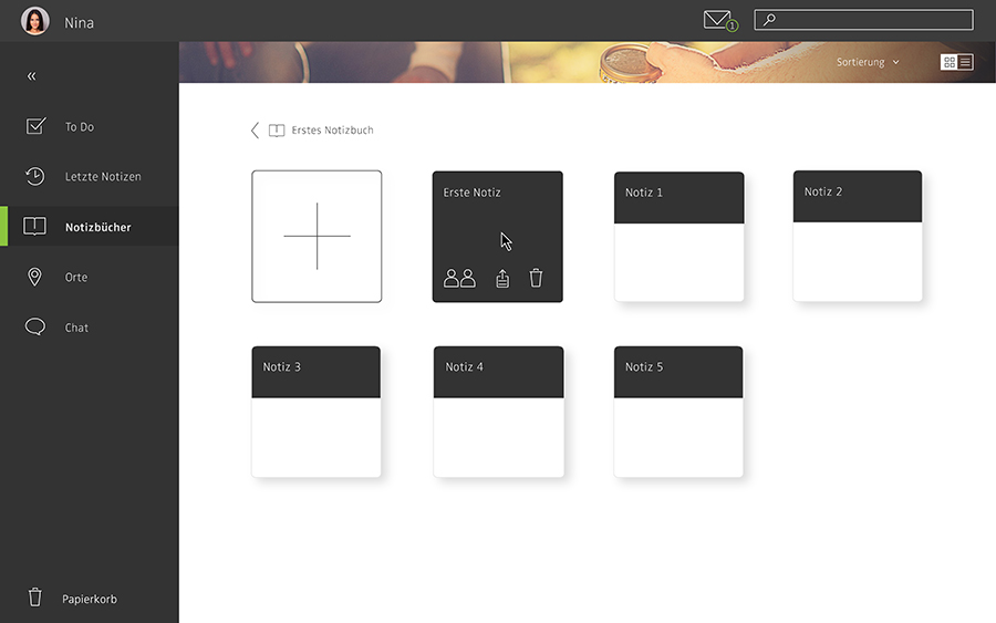
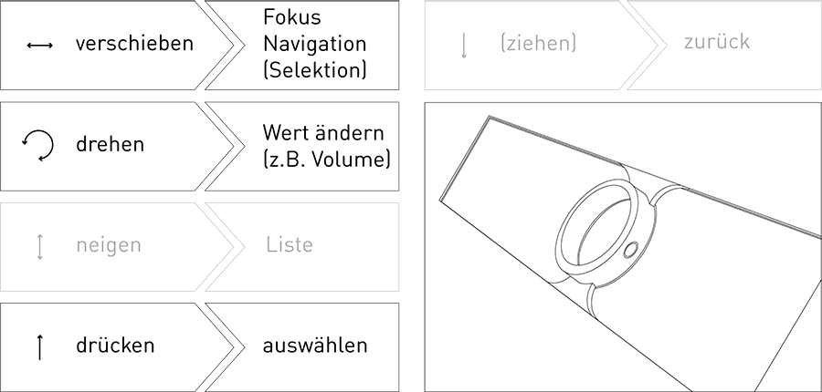
Concept for improved integration of remote employees
What does the work of the future look like? There are a lot of theories about this topic and for many, the dream of a favorite place emerges as a new office. Digital nomads have been on this path for a long time and are already living it. According to a sample by Akin Rumpf from 2013, 74% of German companies already work with teams that partly consist of remote members. This part of the staff is therefore not on site, but works together with the colleagues present at the site. However, 75% of the teams fail to integrate remote workers successfully due to the distance. (1)
The goal of "remotely" is to create digital proximity.
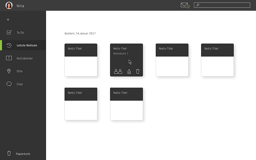
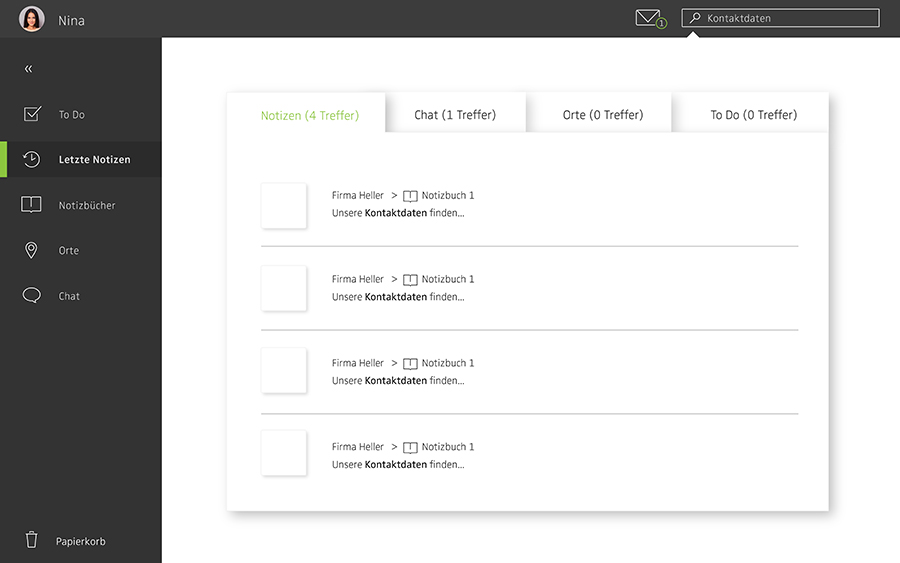
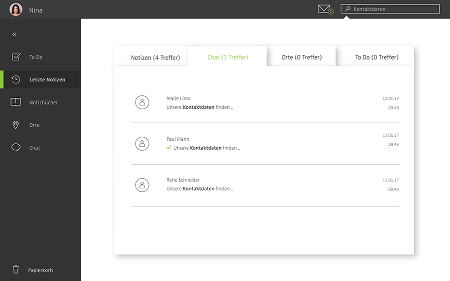
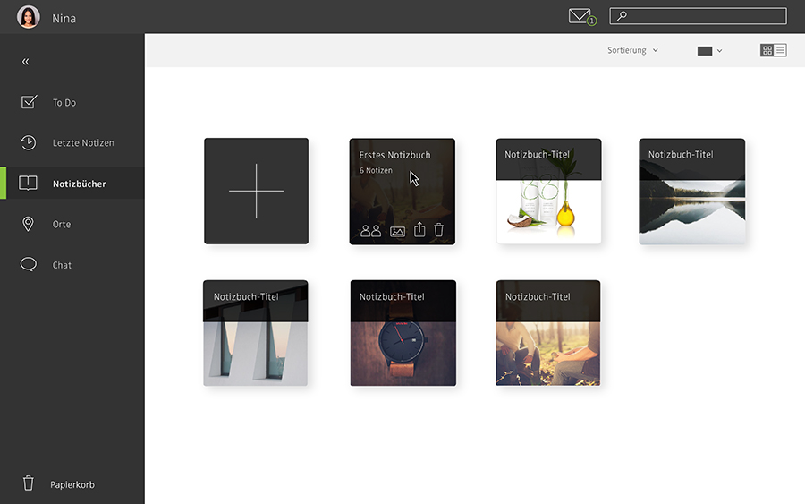
It is a concept for a project management tool, which allows a better integration of the remote employees. New functions, such as sharing intermediate information, help requests to targeted persons or a shared pool of ideas stimulate communication between the team members and promote a working climate of mutual help and cooperation. In addition, information such as mood and suggestions for improvement are recorded. This not only creates benefits for remote workers, but also for the group at the site. That is the goal of "remotely" - to connect people and to provide a platform for the whole team.
Work Mood
Daily mood inputs capture both personal and cumulative team spirit. Personal remains private. In this area, you can observe a progression across the project that can be better anticipated, reflected, and improved.
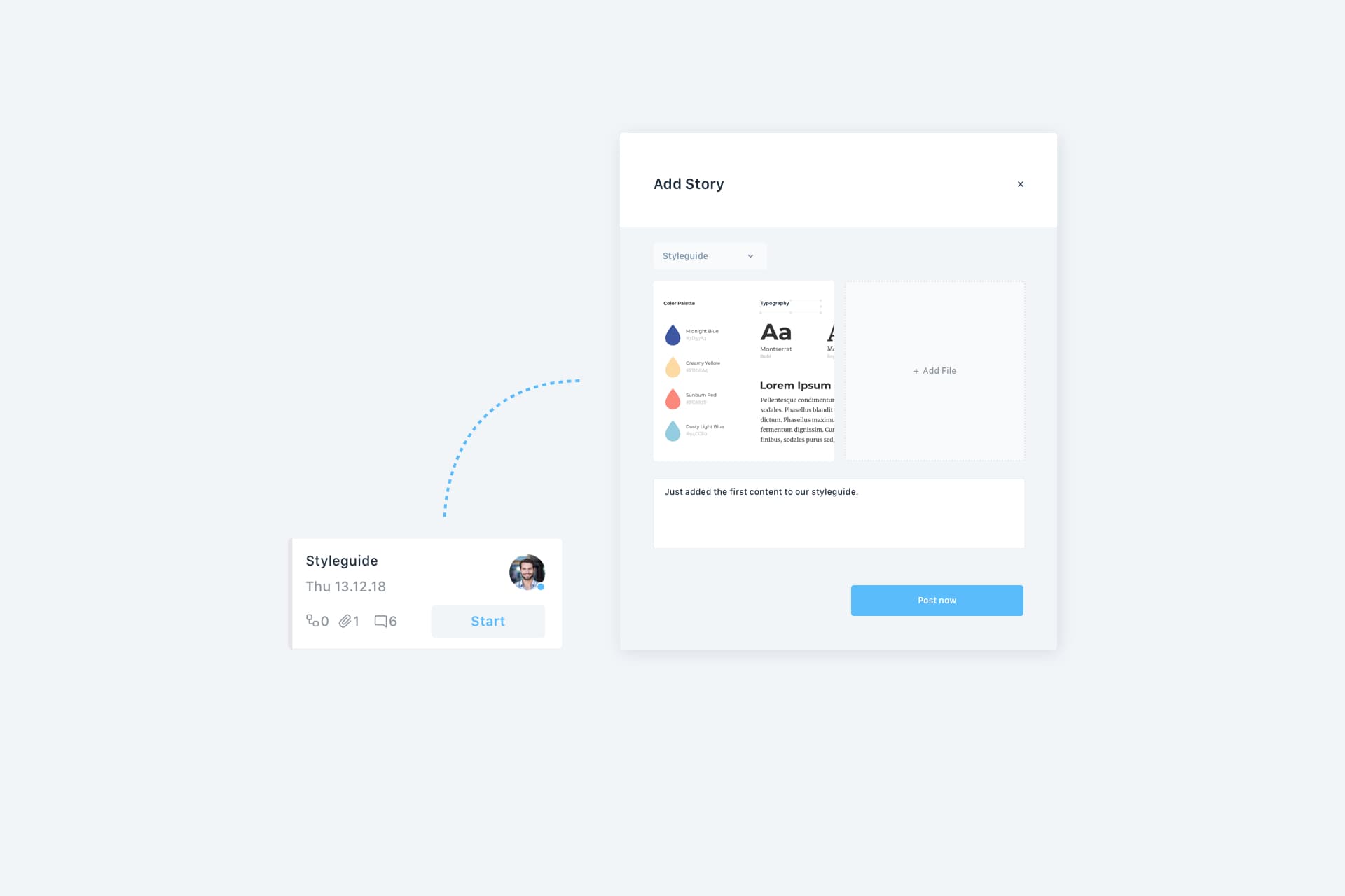
Stories
Interim results of a task are published by a simple sub-principle and located in the respective task. This makes the work process in an exciting way visible to all team members, because it's fun to watch news and progress.
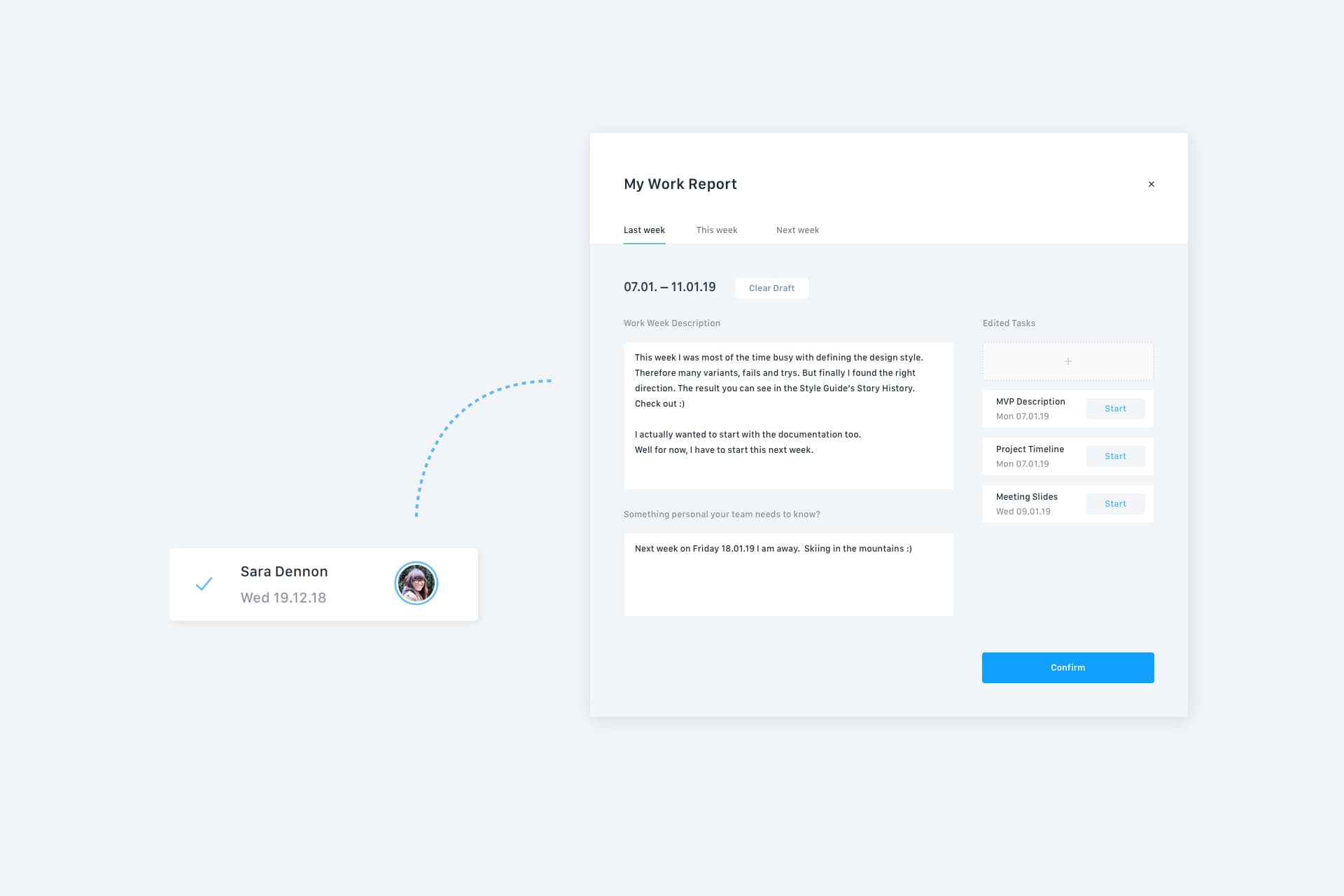
Work Reports
Who worked on which task last week, what is being worked on this week? This area is used to make daily stand-up meetings accessible for members who are temporarily unable to attend.
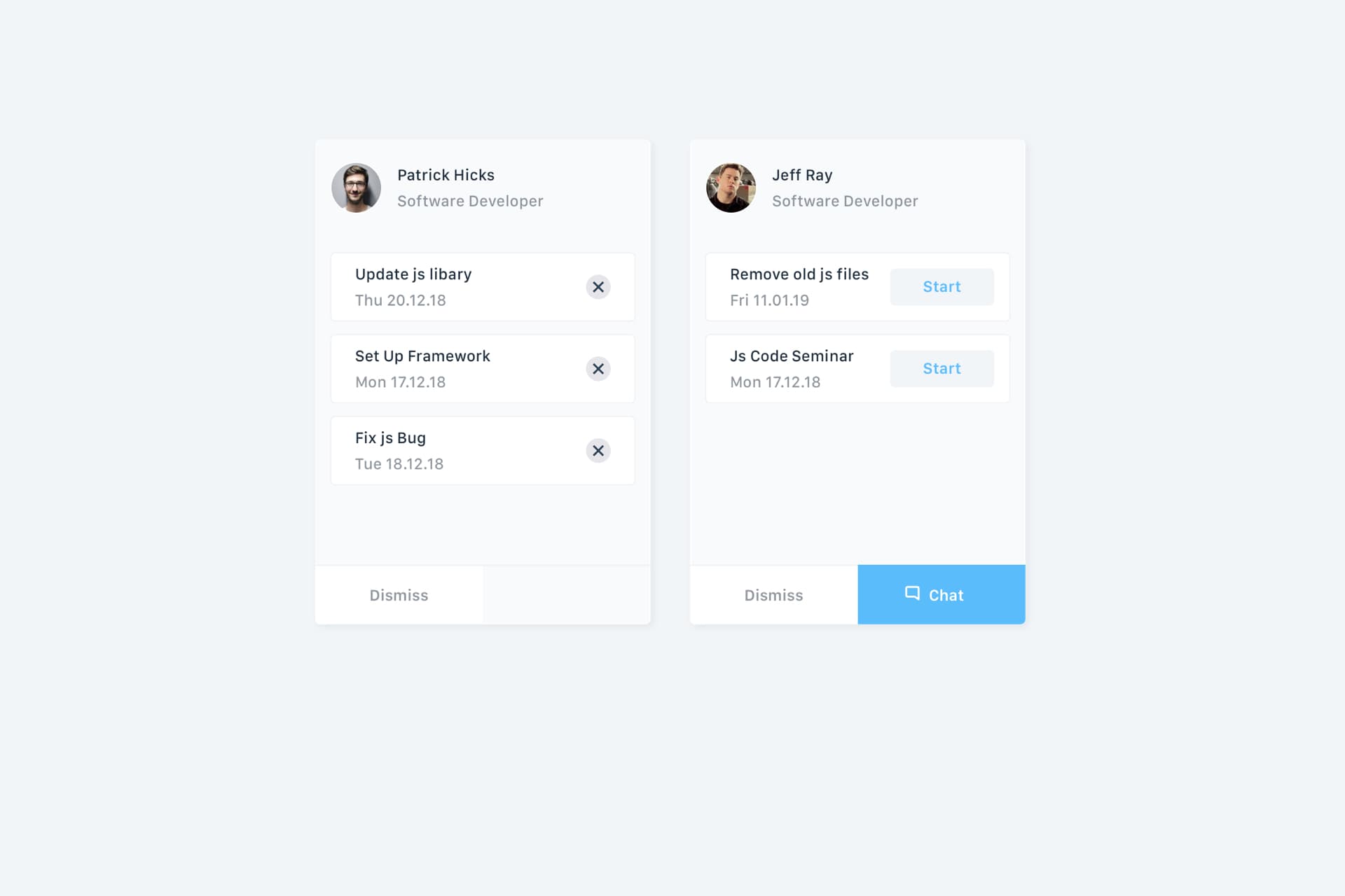
Skill Search
If you are looking for help, ask. Who does not know who to ask can find help in this area. Through keywords in tasks, the system suggests employees who are familiar with the problematic area.
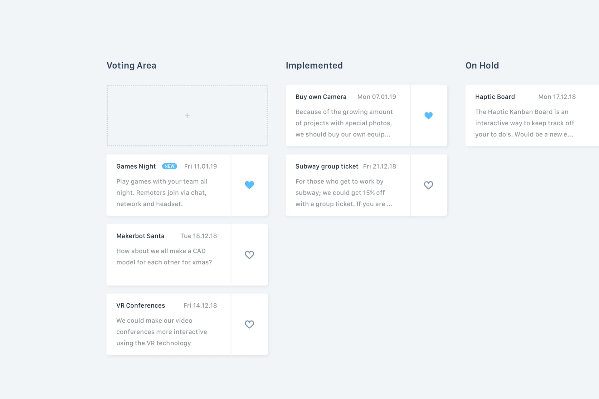
Ideapool
Good ideas often get lost because of lack of contact or the courage to pronounce them. Through a common pool of ideas, all team members can post their own ideas and like ideas of the others. So the company can be improved by itself.
(1) Fajen, A. (2017), S.4 ff.
Literaturangabe:
Fajen A. (2017): „Erfolgreiche Führung multikultureller virtueller Teams:
Wie Führungskräfte neuartige Herausforderungen meistern“,
Springer Gabler: Bamberg: 2017
Interaktionsgestaltung: 7. Semester
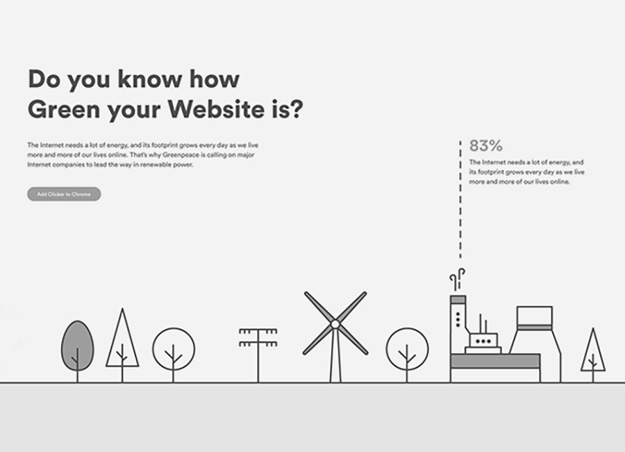
Do something good for the environment? Most people think at first about reducing plastic waste, driving less with the car or turning off the light. But what effects has the digitization in everyday life, such as streaming music or chatting with friends, to the environment?
With the project "GreenScreen" we want to achieve a change on the part of the user and change on the side of the companies. The user should be made aware of the energy consumption of the respective website with the help of an add-on and, if possible, forwarded to more environmentally friendly services. At the same time, the user can stimulate the company to act by signing a petition.
The project is divided into three levels. The first level, is a point in the browser bar, which works by the traffic light system (green, yellow, red) at first glance shows in which category the current website is. The second level is accessed by clicking on the point. Here you can get more detailed information about the respective website and, if possible, a greener alternative. From here you can get to the actual website, the third level. Here you can find more information about the project such as the structure of the SUS formula, your own profile in which you can analyze and compare your own behavior and the download page for the add-on.
Our categorization is based on Greenpeace's "Clicking Clean Reports", which are made publicly available annually on their website. The organization examines the various sources of energy that large companies use to run their website. We have incorporated Greenpeace's "factor" (note) into the SUS formula, which, in addition to the data center energy source, also takes into account the transparency and signing of a commitment.
Interaktionsgestaltung: 4. Semester
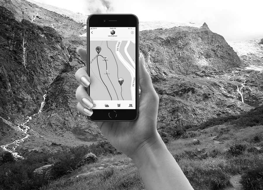
Mobile interaction with an alternative haptic input. This is what this project ist based on. As Wellington is famous for it's trails (some of them start dirctly in the city), the theme of this application is hiking. It was an industry project with the Wellington Trail Trust.
The core of the application is detecting and storing the jumps or turns in a database, which also includes necessary information about the trail to help the user decide for a route. The target audience poeple who want to go hiking or mountainbikers. The main focus is on hikers. While on the trail, the user can enjoy the view and set waypoints of places he or she wants to remember by jumping. The functionality changes if the user clicks on the bike mode. The app now detects other patterns, which are related to biking.
Once the main Idea was set, the main functionality of detecting jumps was explered. Here are some links to my github exercises which you can use with your own smartphone to play with the accelorameter and gyroscope sensor of your phone. This just works on divices which includes the sensors. This is why you will get no data looking at it on your desctop. Click the list items to enter the working prototypes on my github or the source to see the foundation of the code.
A good amount of the project was working at the backend. Since all the prototypes had to run on a device and you have to enter the console, the firewall was tunneled with ngrok. Since the tracking of a geolocation comes with sensible user data, the process has also to be run at a https (secure site). This is done by starting a server and creating the demanded environment with ngrok. After connecting the mobile device to the laptop it is possible to open a console for this special task in Safari. This browser comes with thid debugging function. Common erreors are also conected to the security settings on the mobile device. So several points have to be checked to allow the tracking of the geolocation.
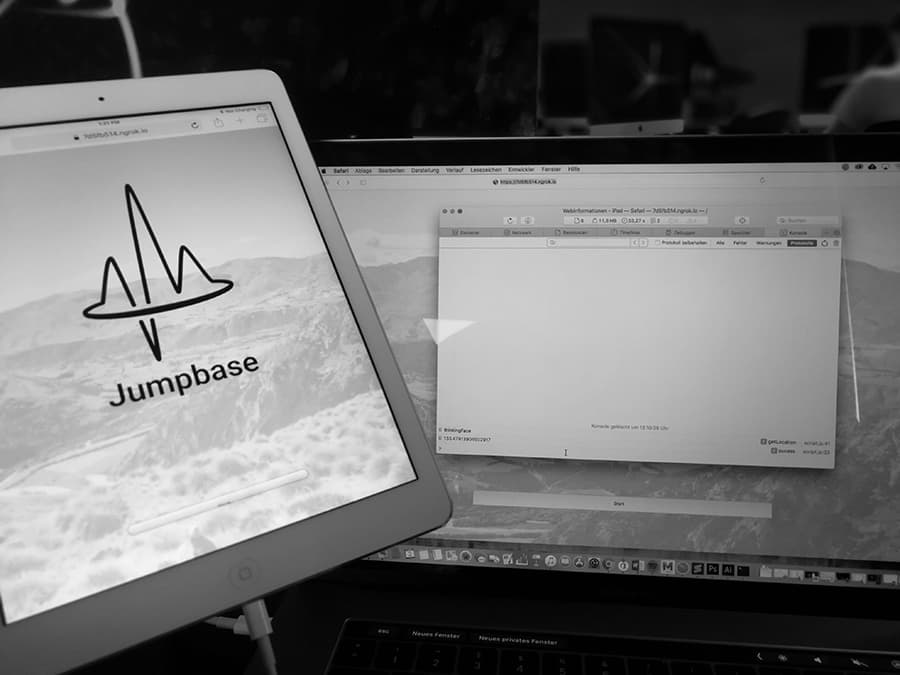
One of the taskas was to create a quick and dirty design approach with figma.
Victoria University of Wellington: Post Graduate – Student Exchange
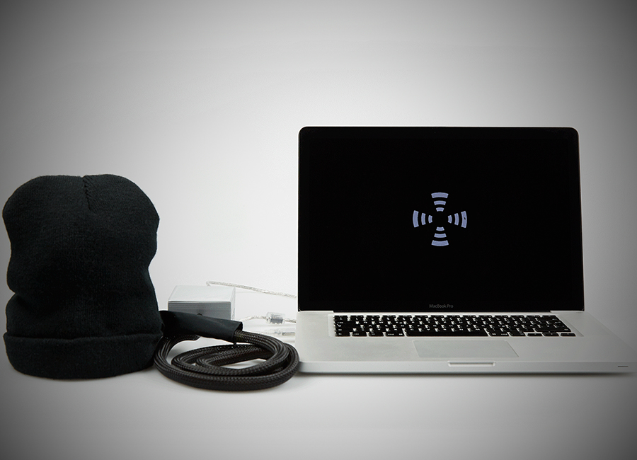
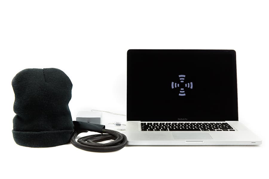
Haptic Sense is a cognition study about haptic feedback. In a series of tests we researched if test subjects could sense the direction of haptic feedback. The experiment set-up contains a hat with integrated vibrating motors (oscillation engines). The motors are cranially located on the sagittal plane and the frontal plane (front, back, left and right side of the head). Haptic signals are emitted by pressing a button on a connected device. The buttons are mapped to the different directions of the motors in the wearable (hat). The test person writes down the location which he or she assumes to be the source of the vibration. The results of all tested persons are being analyzed and compared to each other.
By running this process, we can ascertain, for example, if the haptic feedback is suitable for being used as a pedestrian assistant system.
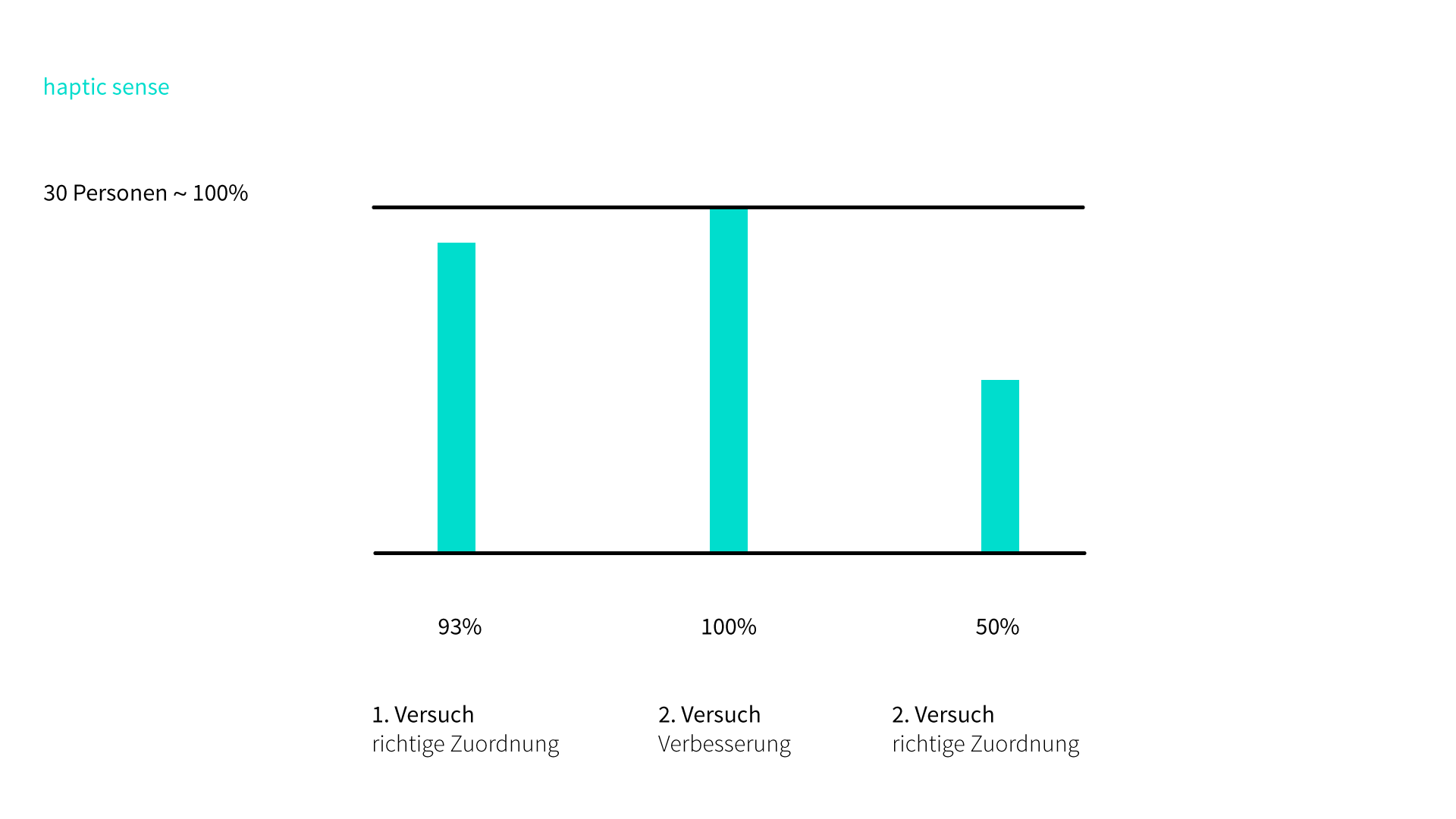
The chart above is the evaluation of 30 test persons. 93% of them could locate the haptic feedback correctly on the first try. Two subjects had difficulty with the location at the back of the head. Often, there is too much hair between the vibration motor and the skin. One of the two subjects was able to get it right the second time.
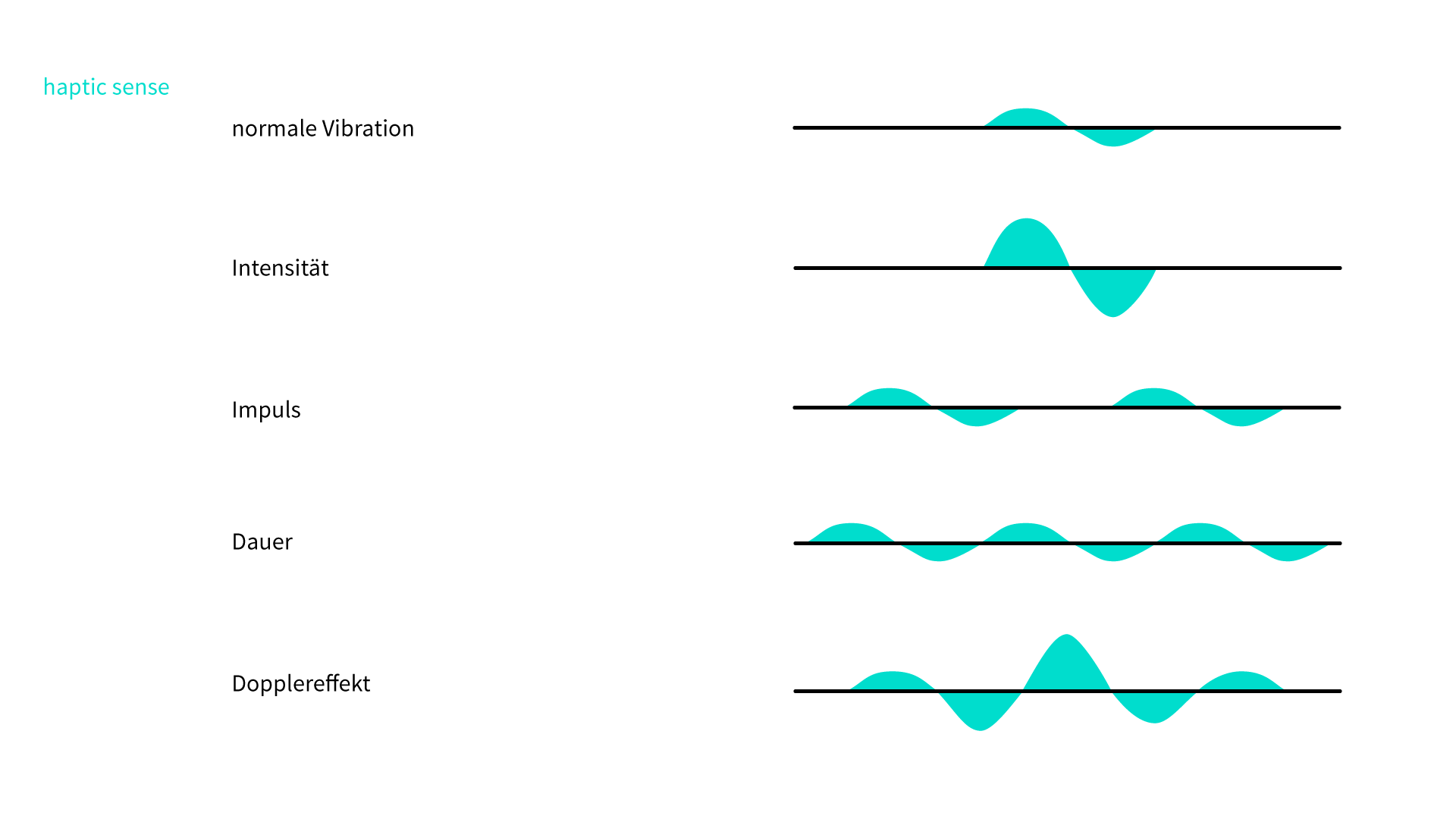
The chart above shows different aspects and qualities of the haptic signal which are possible to emit. We used a basic vibration which was always at the same intensity and length. But, of course there could be different intensities, durations and also patterns such as impulses or even patterns that simulate different situations or objects in the physical world. The next step of this project would be to test those as well and then transfer the test from the laboratory into a real environment.
Interaktionsgestaltung: 3. Semester
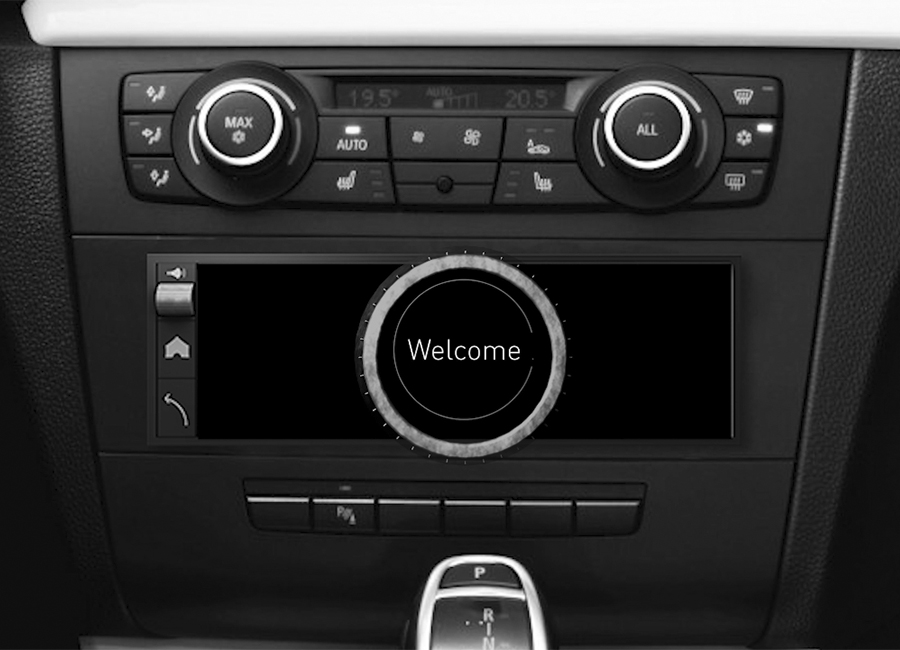
Cyclone is an automobile radio which can be operated by using a specially designed push-and-rotary switch. The focus of this project is on implementing more security into the car by using the haptic usability benefits. This video focuses on operating the car while it's stopped and not driving. Often the radio is a destraction for the driver and using it can lead to dangerous situations. But additionally, if the person next to you is operating it, an unreliable system can alarm the driver.
This picture was created at an early stage of the project. We mapped different interactions to basic functions of the radio. Later on in the process, we eliminated two of these to reduce some of the complexity.
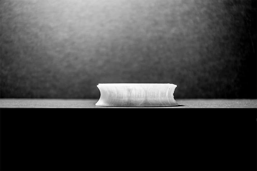
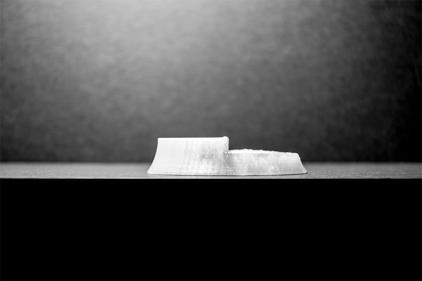
To make sure that the haptic usability of our design would work to the benefit of our users, we built a push-and-rotary switch. We tested if the switch caused any areas on the screen that would be not visible or overlapped. The lower two pictures are photos of the results we printed with the 3D-Printer. We also found out that the quarter rounded version did not fit in order for the user to reach it properly. Therefore, we decided to use the half-round version in our simulation.
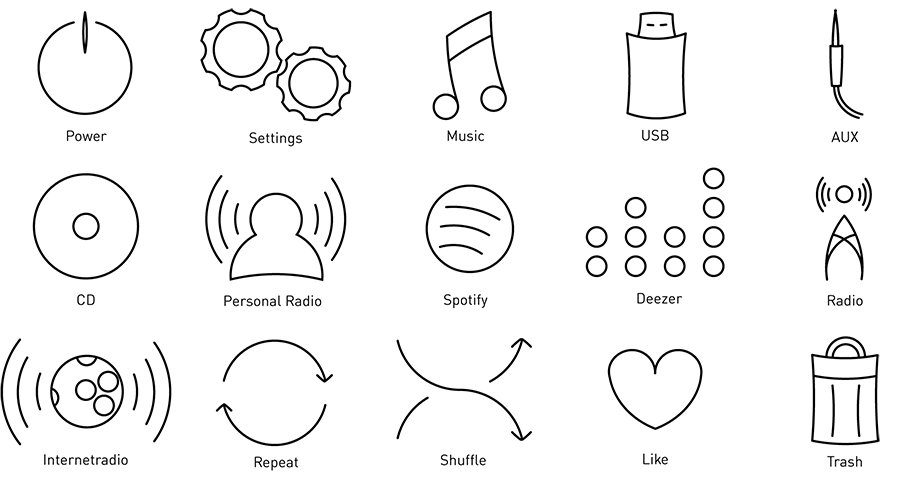
This is the icon set we used for our interface. Because we were going for a consistency with the use of circles as the main shape, the icons are entirely built using circles. We used no straight lines. It was one major design aspect to balance it with the recognition and mental-models of the user. The average person is used to icons which are easy to identify.
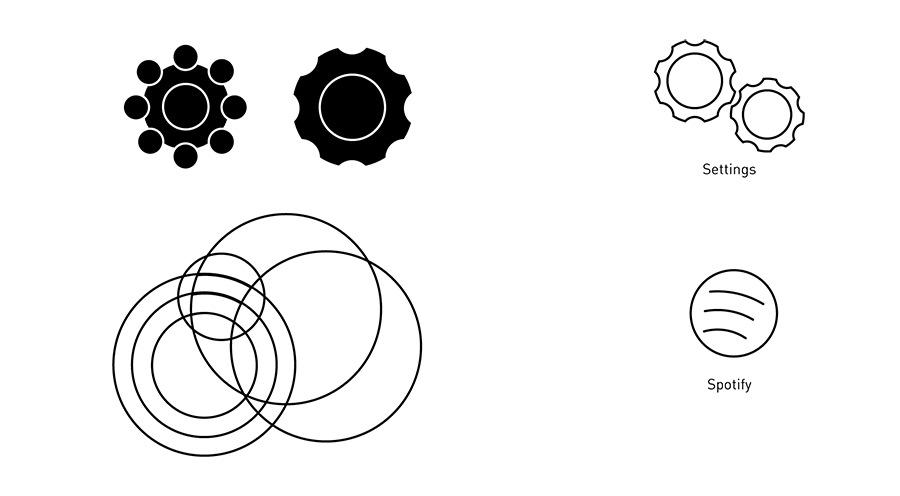
These two examples show the two ways we applied to build an icon. We used the pathfinder tool from Adobe Illustrator or we simply cut of the paths at crossing lines.
These are the key screens of our interface. As you saw above, they are the same screens we used in the video. By looking at them and comparing it to the video you can see what a difference it makes to have the push-and-rotary switch in the middle. We also used a bit of shading to highlight important parts like the selected function. The highlight color we used was a pure red.
Interaktionsgestaltung: 2. Semester
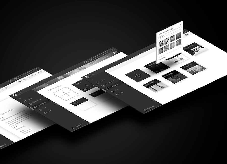
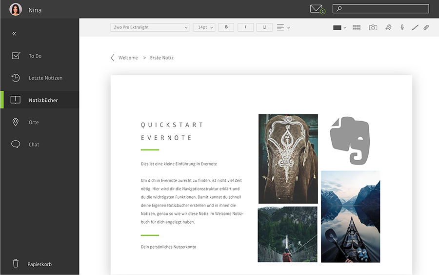
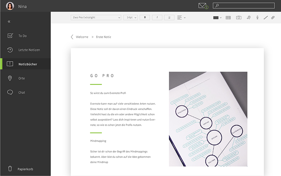
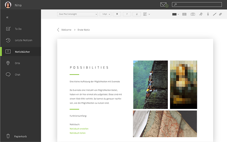
This project is a redesign of the popular application Evernote. We decided to take a look at the pain points in using the software. During our user interviews, we realised that the habits and pain points of our fictional personas also appear in the behavior of real persons.
After looking at reversed wireframes of the original Evernote application, we thought about the different areas of the screen and the functions which are located in them. We came up with different arrangements. In the end, we decided that the navigation on the side could fold like a fly-out-menu. Thus, the user has a larger screen to operate. This vertical navigation would also be a good option for other devices like smartphones. The following wireframe was used to achieve more control of arranging the different areas.
At first, we analysed the information architecture of the original Evernote.After we got rid of the indifferent and the reverse qualities, we realised the main functions you can see above. Light brown are the must-be qualities, green are the One-dimensional qualities and the aqua colored characteristics are attractive qualities.
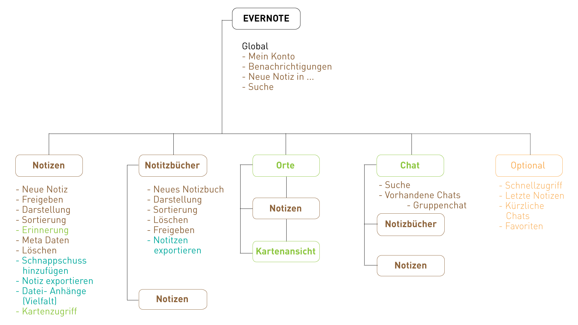
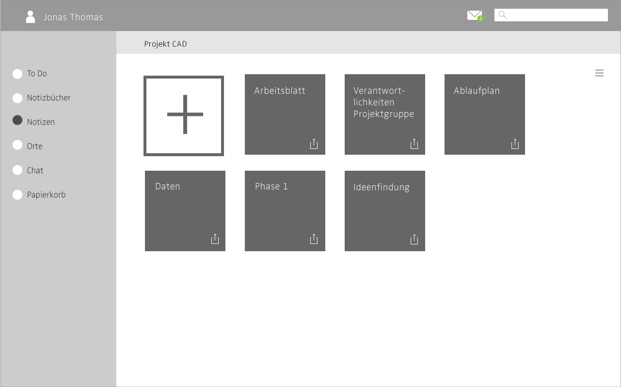
This is an early wireframe just with basic functions. We tried to come up with a prototype in principle at an early stage of the project. Our goal was to test the information architecture and make sure that the application fits to mental models of the user. For example, users are used to the folder, and applications like Dropbox use the same learned system. Therefore, we thought Evernote would fit very well in the list of folder system based applications.The notebooks are basically folders in which you can put your notes.
We worked with the prototyping tools Princile as the main structure and Framer for specific animations. To look at the animations, you can watch the video at the top of this page. The following are our key wireframes.
For further information, you can download the documentation of this project below.
Interaktionsgestaltung: 3. Semester
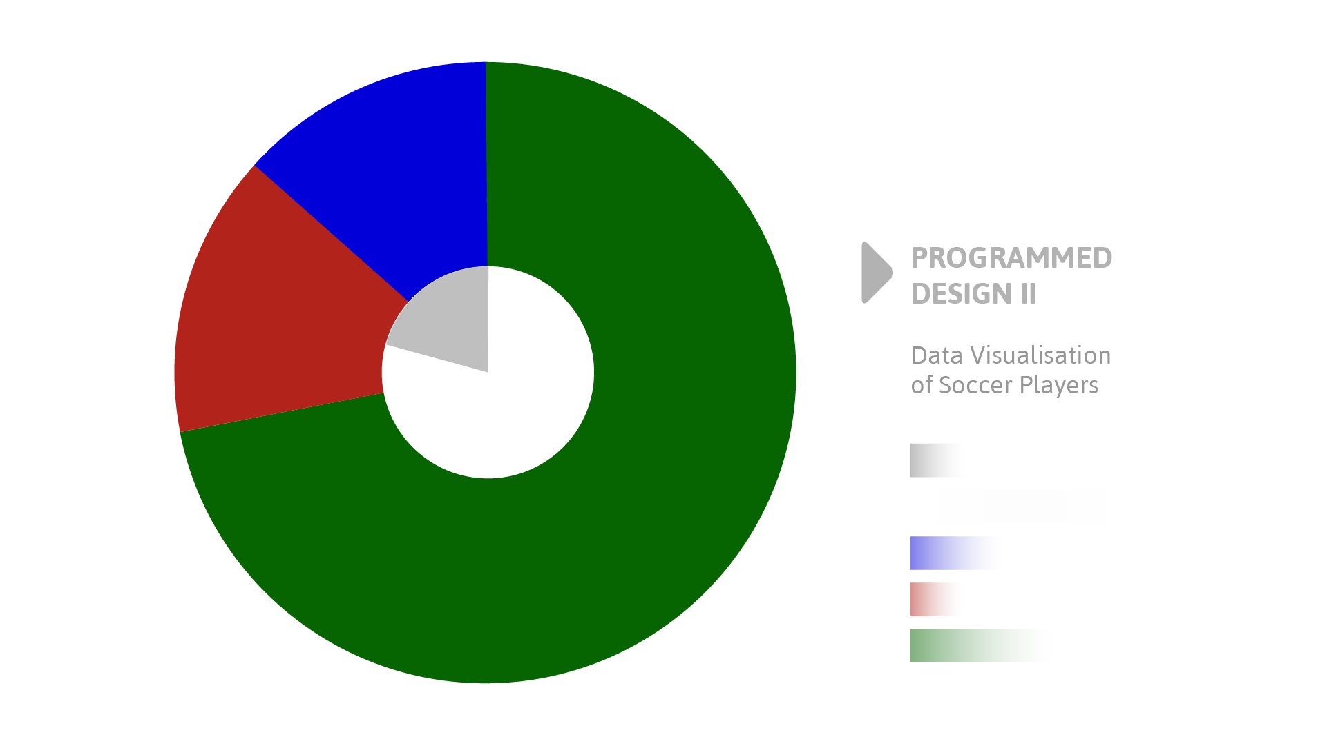
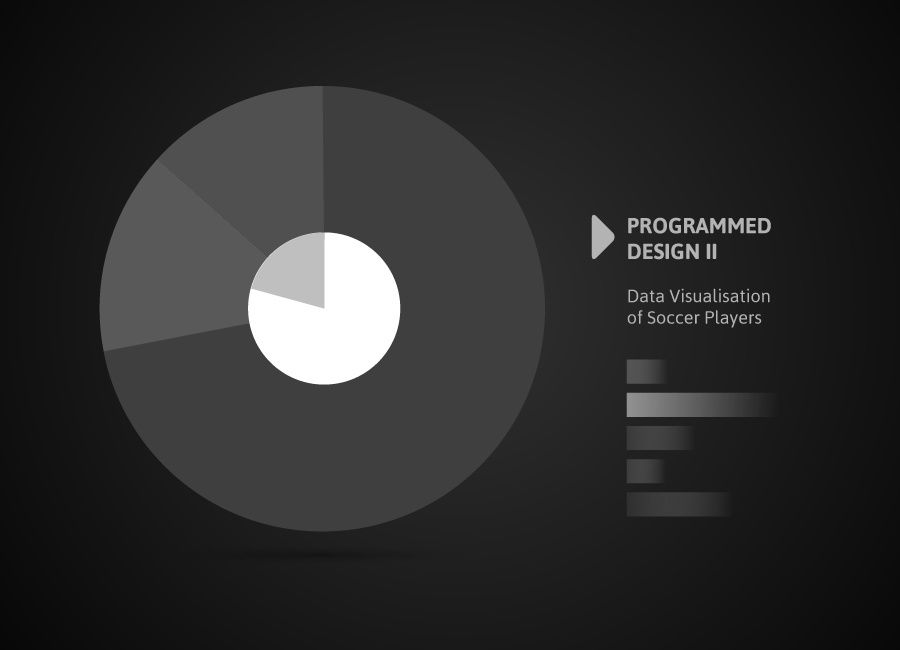
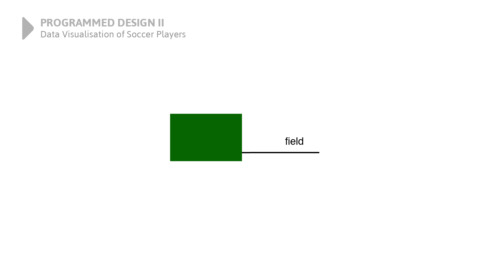
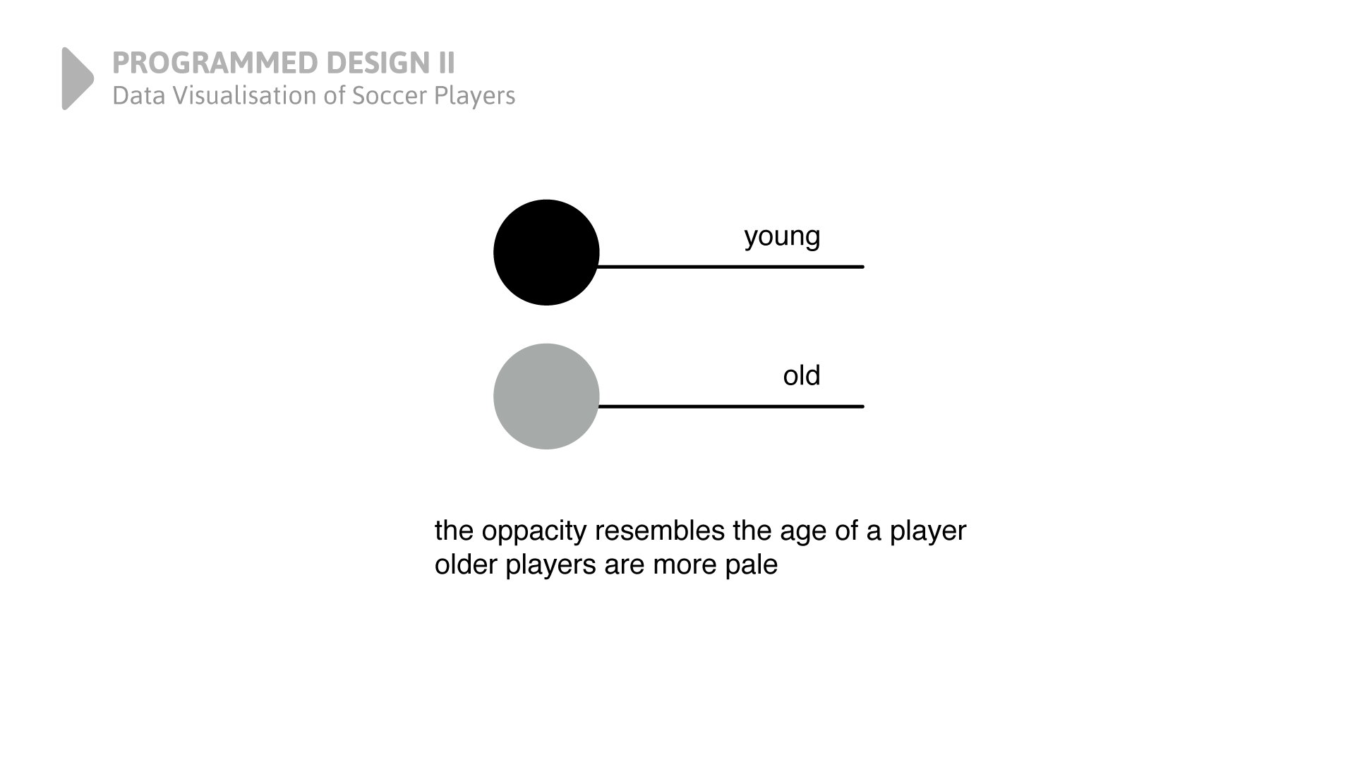
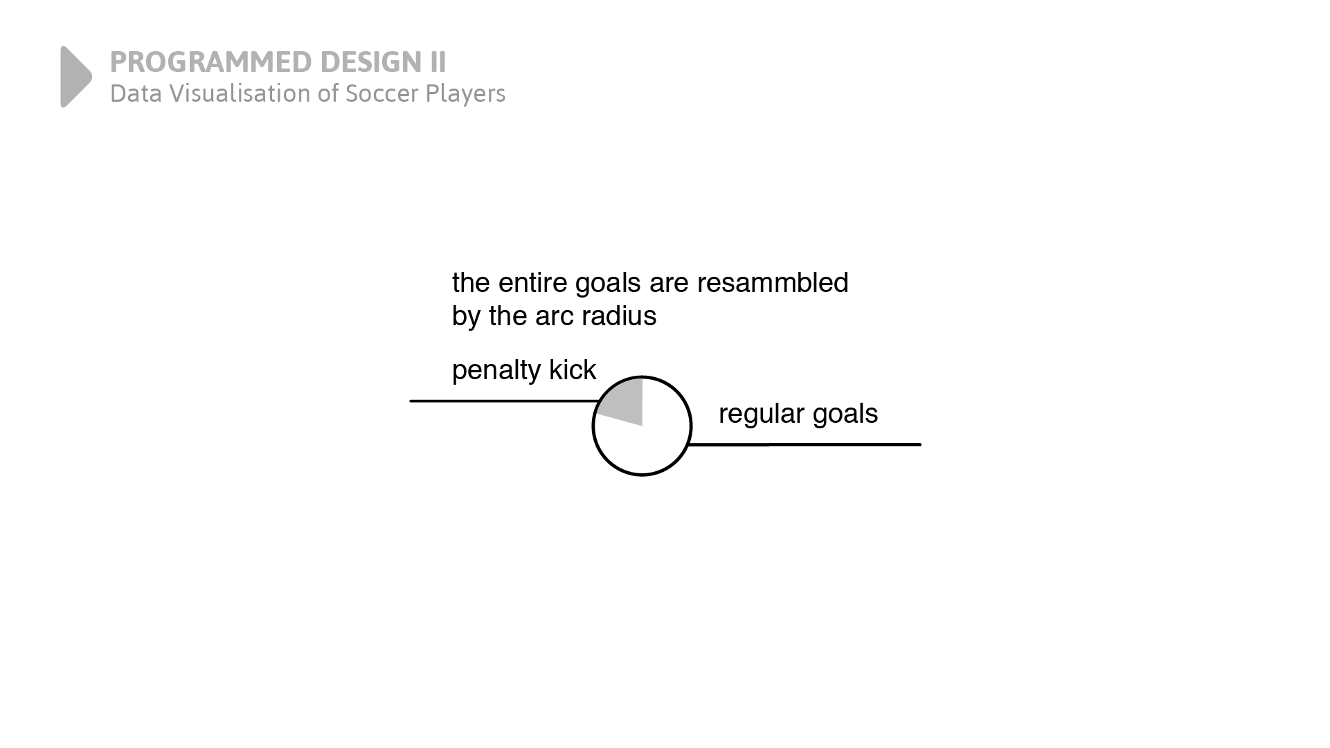
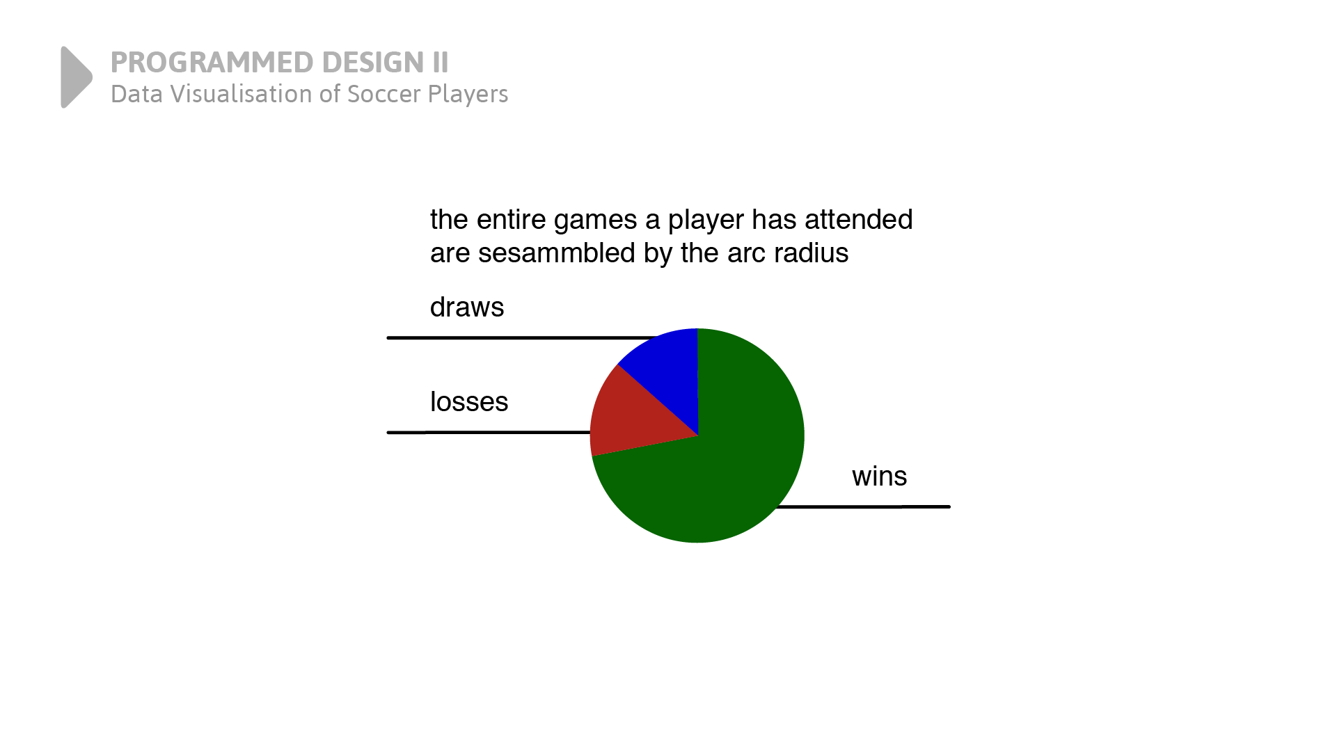
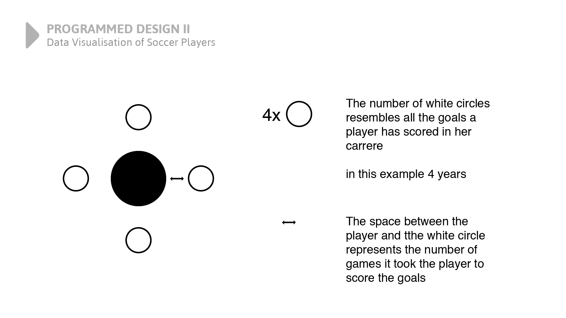
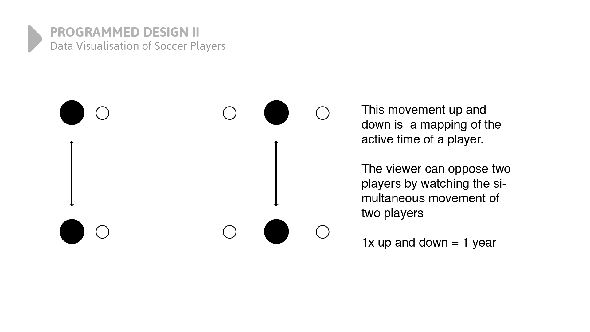
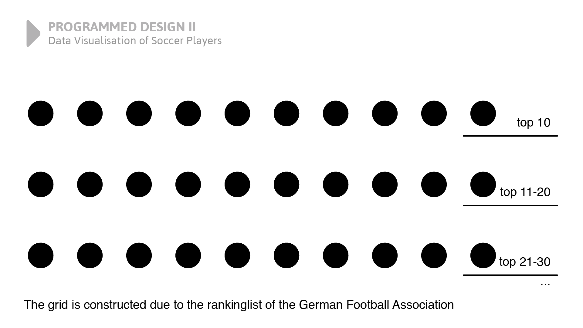
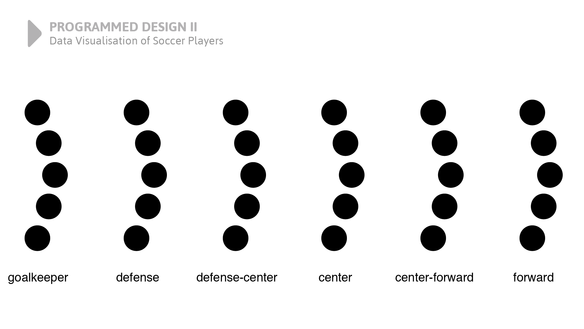
This project is about data visualisation and a generic design. At first, we researched a topic on which we could find a suitable statistic with many characters.
The slider above contains all the mappings of this project. Different attributes of players are mapped to objects and animations.
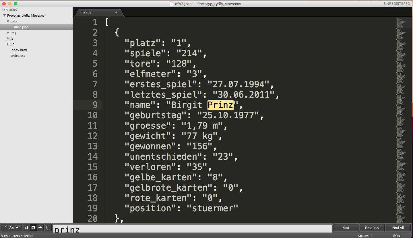
The researched data from the German Soccer Association are located in a Json file. Here you can see Birgit Prinz highlighted. She is the most popular female player in Germany. Here Birgit is, like all the other players, an object with many attributes.
After loading the data in my Javascript, I could start mapping different attributes of the players on my divs and animations.
$.getJSON("data/dfb2.json", function(players) {
// json data loaded
// add index field
players = players.map(function(player, index) {
player.index = index;
return player;
});
...
});
This video is the prototype which was created using JavaScript, and mainly jQuery and Velocity. I simply filmed my screen while interacting with it. All the different attributes of the prototype you see and even the animations are mapped to different characters of female soccer players.
For further information, you can download the documentation of this project below.
Documentation Download

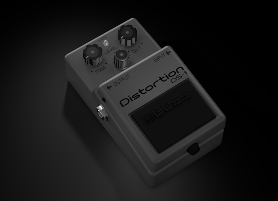
 Drag the image above with your cusor left or wright to see different views.
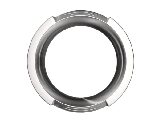
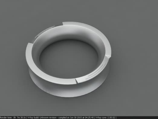
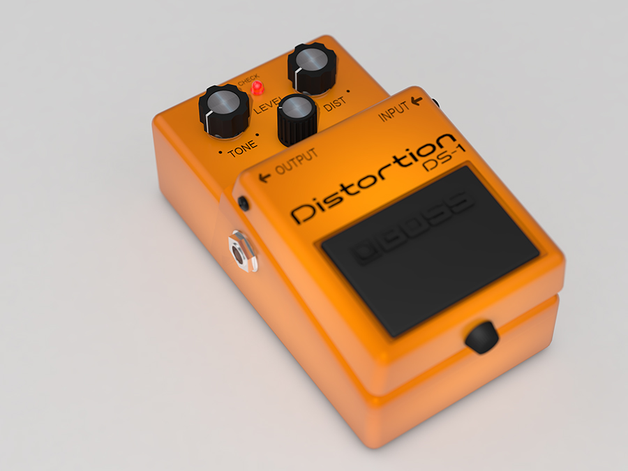
To create this 3D Model, I used several textures. For example, a steel texture for the input and output nut to get a more realistic metallic look.
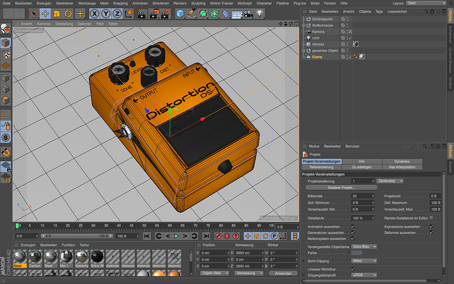
This is the original picture I created in class. , I implemented a camera. The settings of the camera are adjusted as you would adjust a real camera. This made it possible to set a focus and get a little bit of blur at the parts of the photo that are not in the main focus. But as you see below, one way to get the full benefit of a 3D model is a three-sixty slider.
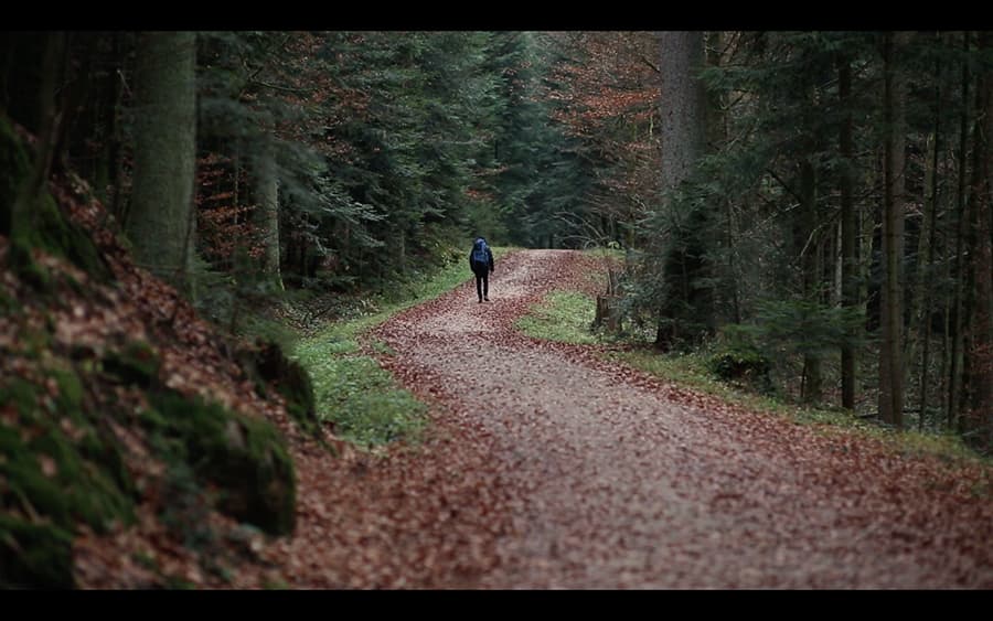
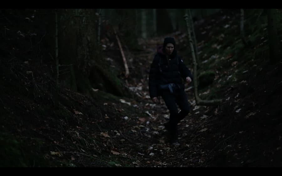
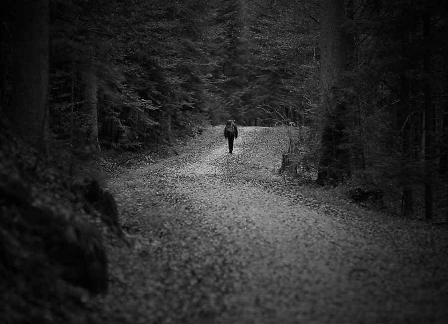
This is a movie we created during a workshop. My main tasks were planning the movie and cutting it. Therefore, I created a storyboard and we went into the woods near Schwäbisch Gmünd to capture the scenes. The best way for you to make sure if I ever found my way out of the woods is to contact me.
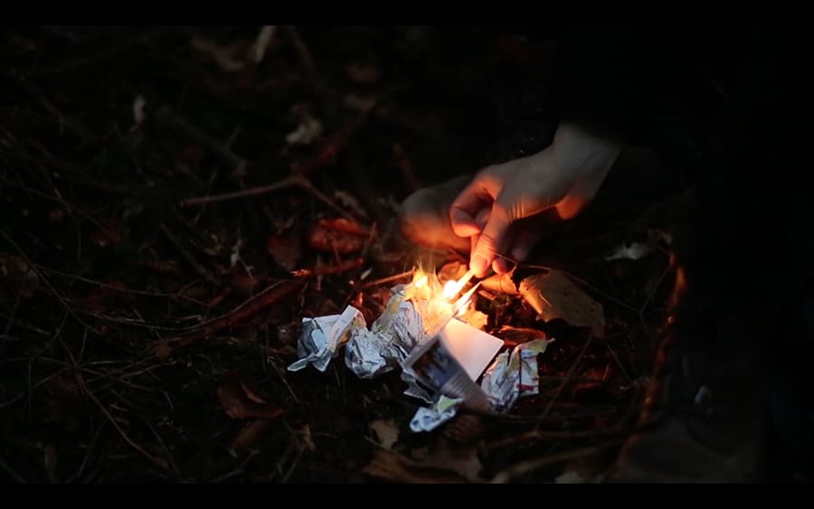
A backpacker goes on an adventurous hike in the forest. She loses track of the trail and gets lost as dawn is breaking. She panics and resigns in the end as the night sets in. In distress, she warms up by burning her map and risks now losing her last hope of finding the trail. But soon the map is completely burnt, and the last match is also gone.